We all know by now that website copy is multifaceted. Alongside communicating your brand, targeting SEO, aiding usability, sharing your message, and showing people what you do, we also have the most important thing that website copy does for you: encouraging conversion.
When it comes to conversion-driven copywriting, we of course need to look at things like CTA copy and button text but many people underestimate the importance of formatting and content design. Before we go too much further, I want to clarify the difference between the two elements.
Formatting vs content design
Formatting is looking at things like use of bullet points, how often you separate text with headings, the level of heading you choose for each (H1, H2, H3, etc.). Content design on the other hand looks at more structural elements like font choices, text size and colour, elements like tables or columns, white space, and highlights.
In terms of what this means for someone receiving website copy, formatting will be clear in the document and content design elements may be suggested in the comments or provided in wireframes (at least that’s what I do, anyway).
Now we’re clear on what each of them mean, let’s look into how they can kinda fuck up your website performance.
5 ways formatting and content design could be harming your conversion rate
- Too much text between headings
- Folding key information like pricing, processes, and what’s included into paragraphs
- Showing comparisons one on top of the other
- Writing a blog when you’re actually writing website copy
- Text size below 16
1. Too much text between headings
One of the most important things to remember with any kind of writing is the context in which people will read it. When people read website copy, they scan the page for relevant information. And, because just about every industry is so saturated, if your website presents a big wall of text, they have other places to go to where they can get information much more easily.
All too often, I see companies with shit tons of copy on their website for the sake of SEO. And ultimately, all that does is harm conversion because no one stays around for long enough to find out what they’re looking for.
So when we look at how website copy impacts your conversion rate, we can’t ignore the simple beauty of short and sweet tidbits spread out throughout the page.
2. Folding key information into paragraphs
It’s essential to include key information like pricing, processes, what’s included, and timelines in your website copy. How else will people know what to expect? However, it is vital that all of this information is visible at a glance.
You can use things like bullet points and content design choices like highlights, different fonts, or different colours to highlight this information as needed.
For example, if you look at my website copywriting packages page, you’ll see this:
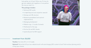
Key details are in bullet points with a little text above to introduce it. Cost is highlighted and important information about timelines and optional extra are underneath. So if someone wanted the scoop on my packages but couldn’t be bothered to read the other copy on the page (this is the norm), they can see it by simply scanning.
If you bury the lead, the leads won’t come.
3. Showing options one above the other
A comparison table is a staple on ecommerce sites for a reason. It allows you to compare options directly in a way that our brains will process the information as one, rather than sequentially. We can do the same on websites for service-based industries.
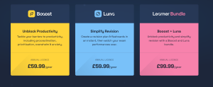
There are cases for one above the other, particularly if you have two options for different audiences, much like on my own website packages page. However, putting the two or more options next to process the information in direct relation to each other.
Here’s an example from a website I worked on earlier this year for Booost Education:
4. Writing a blog when you’re actually writing website copy
It can be all too easy to cram in every possible piece of information onto the page because what is they also need to know that? They probably do at some point, but not necessarily at this stage. It’s also important to remember that an overly searched optimised website will not save your business.
So how do we fit in all of the information we need without overloading people? It comes down to two things: formatting (see point 2) and prioritisation. The latter is so much easier to achieve with an outside eye. You know everything about your business. How much does someone who is looking to compare service-providers need to know right now?
So if your website copy (in a document or live) looks like this blog post, it may be time to edit it down and reprioritise.
5. Text size below 16
We couldn’t talk about conversion without looking at accessibility. In order for people to glean the information they need from your website on their road to conversion, we have to make sure people can read it. You may think tiny text looks sleek, but if it’s difficult to read, people will look elsewhere.
It’s the same thing as blocks of text, filling your copy with jargon, slow load speeds, and bad colour combinations, anything that slows down your audience’s experience runs the risk of losing them completely. Like I said earlier, just about every industry is over saturated so you need to eliminate as much resistance as possible. There is always somewhere else they can go.
Reduce resistance and improve usability
That’s what all of this comes down to. I put ease of use at the forefront of all of my projects, supporting clients with content design suggestions and simple wireframes to help ensure the copy and design come together towards the same goal.
When there are 50 other businesses out there who do what they do, you cannot afford to make a bad impression from the get go. A slow-loading, hard to read, poorly coordinated website tells your clients that you do not have your shit together. Your website is not just a shop window or a vehicle for information. It provides a clear demonstration of how reliable, organised, and easy you are to communicate with.
So we need to prioritise usability in order to increase conversion. If you want to stand out, do it for the right reasons.
I’ve been simplifying websites and improving conversion for over 10 years. If your website isn’t connecting with your audience, get in touch and let’s see what we can do.