I don’t know about you but I fucking love a 404 page. In fact, they’re one of my favourite parts of any website copy projects.
Fun fact: my 404 page was the second page I ever wrote for this website. The first was my about page.
404 pages are the perfect way to turn a shit experience into a good one. Stay on brand, make people feel something (other than frustrated), and keep folks on your website when something goes wrong.
No one’s user experience is perfect
Every website that ever existed has at least one broken link along the way. You’re only human. But a 404 page is the perfect way to be open about your human-ness, admit your mistakes, and still keep people on side.
The go-to tactic for a 404 page is to make it funny. And while I am a big fan of a funny 404, that isn’t the only way. That said, the only thing more frustrating than a broken link on a site, is a boring ass “this page cannot be loaded” or god forbid “404: error” message with fuck all personality.
So I wanted to share some examples of 404 pages I’ve written this year (and some of my faves from across the industry) to give you an insight into how it can be done.
Types of 404 pages (with examples I’ve created this year)
1. Funny, on brand, and taking the piss out of myself
Yes, fine, I’m starting with my own one. But I’m proud of it, let me be a little self indulgent.
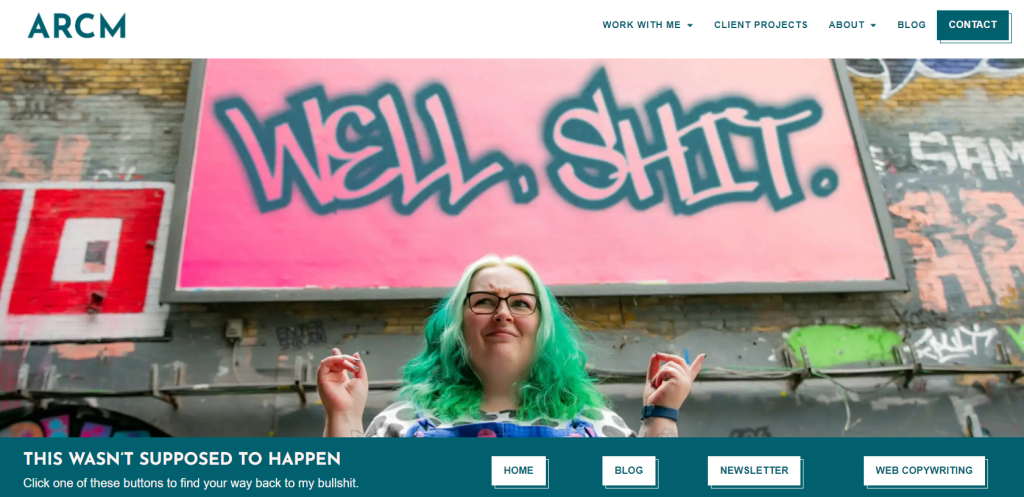
Here is a screenshot of my 404 page as it is seen on desktop. If you saw me speak at BrightonSEO in 2023, you’ll have seen this already. And honestly, I don’t think I’m ever going to change it. Unless, you know, I drastically change my hair colour again.
There are many people who would look at a photo like this and hide it away in a cupboard, never to see the light of day. But (as you’ll probs know by now) I really don’t take myself too seriously. And I swear like a trooper.
Team effort: credit where credit is due
I wrote the words, Tom Garfield from Brand New Notebook designed the page (bonus points for sneaking in the logo of my favourite band), and the photo is a fantastic outtake from my first photoshoot with the marvellous Katie Needle.
2. Calm, relaxing, and focused on wellness
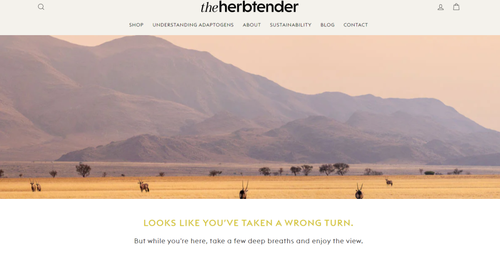
My first website project of 2024 was for The Herbtender. A wonderful small ecommerce business run by a husband and wife team, focused on wellbeing through adaptogenic supplements.
They have a wealth of stunning photography, so I encouraged them to make use of it. A slow fade into a gorgeous landscape, followed by an invitation to take a minute and breathe.
Of course, this is followed by the additional links to get people back to the site. We prioritised Shop By Need as the main taxonomy here to give people enough guidance to get them back on track and find the right products for them.
Funny isn’t the right vibe for every brand. So I wanted to use this page as a chance to help people step back from their frustration and admire the view
3. Simple, friendly, and conversational
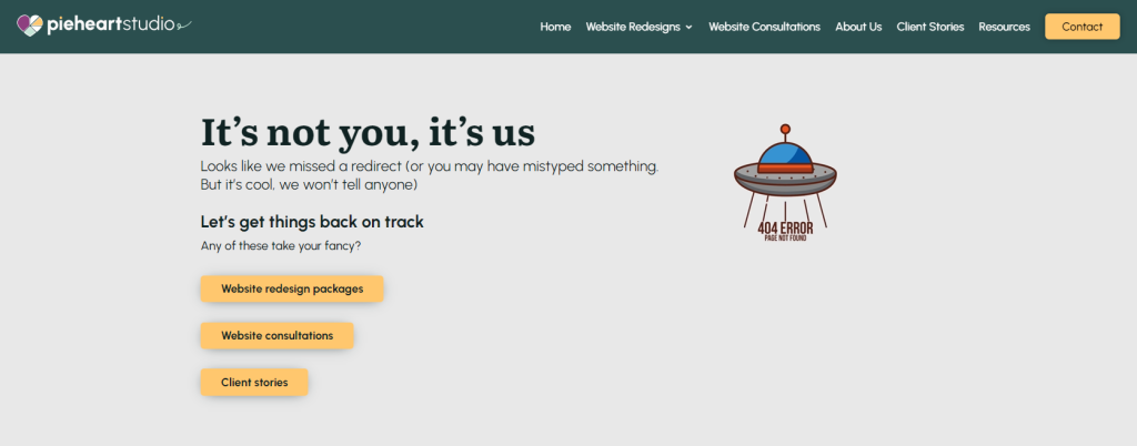
This summer, I worked with Beth Rawlins, founder of Pie Heart Studio to help shift her positioning from solo web designer to full-service website studio (and joined the team while I was at it – very exciting!).
Beth’s vibe (and that of the studio) is very welcoming, inclusive, friendly and knowledgeable. She’s running an incredibly successful studio (proof that you don’t have to be loud and brash and stand out).
So we agreed the best approach would be a simple one. Conversational, a little quirky, and focused on usability first. The perfect summary of Beth’s approach to all things websites.
4. Puns, personality, and PR
So, I can’t share this one with you yet because the website isn’t live. I promise to update you once it is.
Another project this summer was to support Tom and Jo to join forces to create a fantastic 2-person PR team. The key themes in our onboarding and messaging sessions was irreverent, wise, and a little bit kooky. A winning combination if you ask me.
With plenty of references throughout the site to data nerdery, clogs, and etymology, I knew they’d be up for a good pun. As an out and out millennial, I will never turn down the opportunity to write punny copy.
It’s short, sweet, funny, and to the point. And I can’t wait to share it with you.
Some of my favourite 404 pages from other freelancers
When you’re running a one-person band, it can be so hard to really commit to the bit in your tone of voice. So many freelancers are scared to piss people off, make people cringe, or lose out on business.
But the best brand experiences are the ones that are committed, even in the smallest of places that very few people will ever read. I’m talking form error messages, T&Cs copy, and yes, 404 pages.
1. Emma Cownley – JotJotBoom
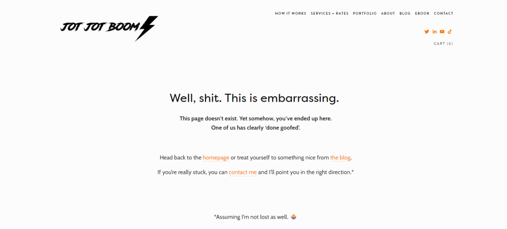
Emma’s website is a masterclass in committing to the bit with messaging and tone of voice. From her 1:1 service (called The Witching Hour) to her form fields and T&Cs, everything has a spooky, witchy, delicious vibe.
Her 404 page reflects how she speaks. Something I absolutely fucking love. A cheeky bit of swearing, a couple of emojis, and some great conversational copy.
Another nice touch from a UX perspective is the encouragement to contact her if you’re really lost, assuming she’s not lost as well.
2. Nikki Pilkington
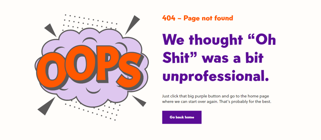
The queen of non-wanky SEO herself, Nikki Pilkington’s 404 is full of colour (much like her hair), swearing, and humour. Clean, simple, and packed full of personality. Another one, I believe, designed by the fabulous Tom Garfield.
3. Brand New Notebook
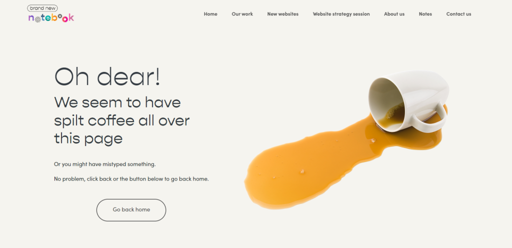
I couldn’t bang on about everyone’s 404 pages without mentioning the man who designed a bunch of them.
Tom, alongside his lovely wife Ellie, run Brand New Notebook, a mini agency who create conversion-driven website designs for businesses of all shapes and sizes. The copy across their website is wonderful.
A genuinely lovely pair of people, their 404 page reflects their relaxed and easy going natures. And if there’s one thing designers have at all times, it’s a good strong coffee.
Plus, a special shout out to some cracking copy a little further down the page. So special in fact, it deserves it’s own screenshot.
Commit to the bit with your brand and website usability
When was the last time you reviewed your 404 page? Do you have a custom 404 page?
Even better, what do your form fields, placeholder text, and error messages look like?
These are small details that really elevate the experience people can have on your website. Plus, all of this is about turning a shit experience into a good one. Commit to the bit and use this chance to keep people around.
Something I’ve noticed as an extra bonus since I updated my website last year, is that people like my 404 page so much they tell me about it. And tell me where they encountered it. Which is a massive win win as it helps me to fix any usability issues while also making people laugh.
If you want a hand with your 404 copy (or your website copy as a whole), give me a shout. Let’s chat about your business over a coffee and see what we can do.
